Hello my bloggers, today I will be discussing what the adequate font choice would be for my film CUT, and it's credits in the opening scene.
The font that text is displayed in plays a huge role in the marketing of a product and the impact it actually makes on the consumer.
For example, a formal piece of text for let's say a newspaper article would typically be this font that I'm using right now, this font shows formality and a bit of classiness, now a comedic font would be more like this, the unevenness of the letters and the size makes it different, more round, more fun, texts can also be used for the purpose of a drama film
Here is an example:
Hello
Hello
The first Hello is more cursive and fancy and sort of "feminine" could be used for more of a romantic film
While the second Hello is strict, and more sharp, sort of "masculine" can be used for more action-like films.

This SpongeBob title "Pickles" uses a font true to the show, and the producers had to make a choice on what font to use for all episodes, this one captures the comedic nature of the show.
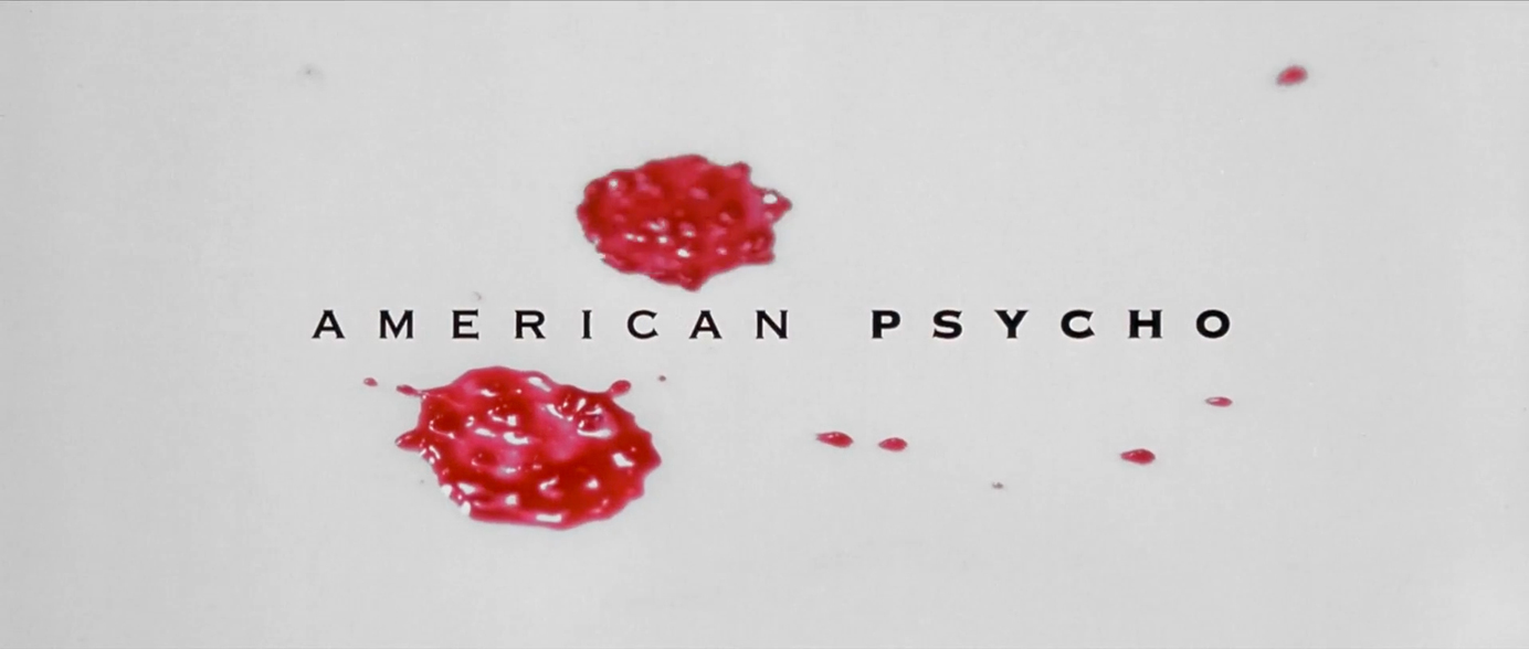
Now to a complete opposite, "American Psycho" uses a strict font, looks classy and for some reason fancy, like rich person type of fancy, makes sense since the film is about a businessman who is a psychopath, the texts boldness on the word Psycho helps.
Final Choice
I feel like these are really good font choices for both credits and the title, this might change throughout the process, but I feel like they belong true to the title and story.
Thanks for tuning in bloggers, and until next time. Goodnight
Citation
The surprising psychology of fonts - fast company. (n.d.). Retrieved February 27, 2023, from https://www.fastcompany.com/90757581/the-surprising-psychology-of-fonts
List of title cards. Encyclopedia SpongeBobia. (n.d.). Retrieved February 26, 2023, from https://spongebob.fandom.com/wiki/List_of_title_cards
Writer Lola Landekic Interviewer Lola Landekic Published August 2, 2018. (n.d.). American psycho. Art of the Title. Retrieved February 26, 2023, from https://www.artofthetitle.com/title/american-psycho/


No comments:
Post a Comment